Sporting CP
Working with brand agency, JKR, we helped to turn a distinctive piece of Sporting CP lettering into a fully functioning brand typeface, giving the club a voice born from its strong heritage.


Match Programme
About
Founded in Lisbon, Sporting Clube de Portugal is one of Europe’s great football institutions. A club with a fiercely protected heritage, a globally recognised green and white identity, and a remarkable history of developing players who go on to define the game.
Luís Costinha — Sporting CP

Font graphic

OOH
Background
As part of its first major identity refresh in 25 years, Sporting CP worked with JKR to create a brand system rooted in the club’s past but built for its future.

Advertising

Players

Brochures
The brief
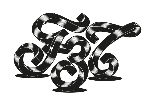
We were briefed by JKR to develop Sporting Sans, a bespoke typeface inspired by the crown and built from a piece of lettering originally used for the club’s internal newspaper.

Crown anatomy

Sketch and Character Set
Delivery
Turning a piece of lettering into a typeface is a bit like turning a talented academy player into a first-team star. The potential was there, but it needed structure and discipline.

Language support and Anatomy

Advertising


Advertising